

The list of things that bug me is practically unending, but if it's narrow, lazy or plain stupid, it probably fits the bill. However, the list of things that bug me so much I've made an actual study on them, collecting primary data myself and stuff, contains, for now, one.
In fact, the lack of diversity and creativity that go into most T-shirt designs that you see in stores has been a pet peeve of mine for a while. I've always believed that people should try to live original lives, instead of behaving according to some pre-made stereotype they subscribe to. I, for one, try to live by that. So I get pissed off every single time I enter a shopping mall or other apparel store complex and look for T-shirts to buy, because most of them are so generic it physically hurts.
It's not that I think the way you dress is an important part of you, altough, of course, it is for some. If you don't give a damn about having your clothing reflect your personality, you can always wear plain shirts. Nothing wrong with that. But if you do wear a T-shirt with something on it, have it be something creative or interesting or fun! Make a freaking effort! Why people are entirely complacent with the lack of oomph or any trace of soul that goes into most shirt designs on the market, and choose to wear sad jokes like "Oh, shoot, is it monday already?" or company logos is entirely beyond me.
So, in order to measure exactly what the situation is, I took it upon myself to go out surveying the biggest brand stores in my city.
Essentially, I am the fashion police.
We.
My good friend and guy-who-really-had-fuck-all-to-do Moses chose, of his own volition, to join me on this quest. He regrets it deeply.
We are the Fashion Police.
Fuck.
__________________________________________________________________
The method we used was, basically, to survey every single individual T-shirt design, for men or women, (not children though) in 4 different large brand stores who are all international franchises. They are going to remain unnamed, because we wouldn't want people to think we have something specifically against Reserved, Zara, H&M and C&A. They just fit our criteria best, in that they are very large and very popular in the T-shirt department, as well as mainstream buyer go-tos.
We did not include in the study tank tops or shirts that had additional frippery like lace, though there weren't many of them anyway, or anything else that didn't fit into the T-shirt category. We didn't include the huge number of blanks (of different colours and textures), of course. We were strictly interested in the art on the T-shirts. (or whatever passed for art on them)
What we did was, we took a good look at each and every T-Shirt, and, firstly, judged it in terms of creativity and originality above all else. It sounds badly subjective, but it isn't quite like that. It only didn't fit into the "original" category if:
i) its written message was a random short phrase or word (like "Hello there!").
or
ii) its written message was a sad tired joke or quote that wanted badly to sound edgy and kewl but failed miserably and was simply cringeworthy.
or
iii) lacking any kind of originality in message or imagery, it also couldn't be said about it that it had well-crafted imagery. Rather, anyone with a minimal knowledge of Photoshop could have made it.
or
iv) it fit into an easily recognizable, overused pattern of T-shirt design (details below).
If it passed, it went into the "Other" category. That is where all designs who stood out as well-made ended up, even if we didn't personally like them. They were obviously at least a little bit thought-out and/or hard work.
All the boring, ugly and lazy ones, as well as those which were plain advertising, fit into one of the categories below:
Beach & Surf & Summer in the Sun: a distressingly large number of T-shirt designs revolve sheerly around surfing, beaches, palm trees, sea waves and combinations thereof. Annoys me way more than it should.
Colourful Writing: these are the work of copyrighters who've simply given up. They contain entirely random, completely lackluster short phrases such as "What's Up?", or, one of my favourite in terms of ridiculousness, the exclamation "Vitamin Sea!" in bright pink. Regarding that last one, I can only hope it's a reference to the seaweed-harvesting business by that name.
Pretty Pattern: here are thrown all designs based on a small, very simple graphical element, or occasionally a few of them, repeated across an entire T-shirt. It's not ugly, just very lazy.
Urban & Cars & American Cities and Streets and Architecture: in this category, we counted all T-Shirts trying to radiate an aura of American Dream, if by that you understand sky-scraper dominated cities, cars, and names of well-known places like Miami or Boston or, worst of all, New York. They are usually simply pictures of buildings, not always nice looking, and give off the impression of stock photos. Or the confidence that they'll sell anyway because, y'see, people fucking love everything American. Collages and other creative variations on this theme didn't fall into this category, just the lazy ones.
Empty Inspirational Hipster Quotes: exactly what it says. And not, like, famous quotes. More like Tumblr quotes.
Branded: which simply advertise the company that sells them. Or, in the case of a few, Walt Disney Co. I'm not sure why those were there, I'm just reporting the facts.
Edgy (to be read as cringe-inducing): these desperately want to be hip, but only end up being a sad attempt. Includes Garfield-style tired one-liners on the lines of I hate mondays.
Sports / University Team
Metal / Mafia / Look at me I'm dangerous and such a punk: does not include the ones with really good art. Just the ones obviously generic.
Music Bands
Kitsch: these are so goddamn ugly, made in so poor taste, with obscenely cacophonic colours or BIG GOLDEN LETTERS, that we had no choice but to give them their own place.
Cammo
Alcohol: tired jokes about beer, mostly.
Very Colourful Animals: again, mostly stock photos.
Tiny Breast-level Drawing: not sure why people like these.
Skateboarding: could have easily been included in another category. But they try to imitate a culture with actual style, only half-heartedly, and are worn by lots of people with no links to that culture, a.k.a. posers. So they deserve their own separate scummy place.
Surprise Categories: a few discoveries we made, we didn't want to ever make. You'll see in a bit.
We surveyed almost 700 T-Shirts. It was hard work, and by the time we were wrapping up, Moses was muttering to himself in a corner "I don't want no more... I don't want... I can't...". I'm not even joking.
*this post is sponsored by the Fashion Police PTSD Foundation.*
Anyway, attempts at humour aside, you can find at the bottom of the page the raw data.
Right here, we're gonna take a look at the overall stats regarding our 689 T-shirts and which categories they fell in:
In first place, depressingly but predictably, came Beach & Surf & Summer in the Sun, with a share of 15.5% of the market.
Colourful Writing: 15.3 %
Pretty Pattern: 11.7 %
Urban & Cars & American Cities and Streets and Architecture: 11%
Empty Inspirational Hipster Quotes: 7.9 %
Branded: 7.8 %
Other: 7.4 %
Edgy (to be read as cringe-inducing): 6.6 %
Sports / University Team: 2.4 %
Metal / Mafia / Look at me I'm dangerous and such a punk: 2.1 %
Music Bands: 2.1 %
Kitsch: 2 %
Cammo: 1.8 %
Alcohol: 1.4 %
Very Colourful Animals: 1.1 %
Tiny Breast-level Drawing: 0.8 %
Skateboarding: 0.2 %
I am smooshing the male and female stats together for this main analysis because I believe the diversity and creativity in tee design is a unisex issue. Still, here are some interesting observations we personally didn't see coming (not all may be that surprising to you. We're pretty ignorant):
-there are way fewer T-Shirts for women. If you think about it, it makes sense. Women have greater diversity of choice in casual upper body wear. (We're talking Western culture, clearly.)
-for some reason, though, there were always way more blank T-shirts in the women section at every store we went to, than the men's.
-Miami and New York are by far the most popular T-shirt cities.
-There was a significantly larger proportion, even considering the respective sample sizes, of the Urban & Cars & American Cities and Streets and Architecture category in men's T-shirts than in women's.
-There was also a significantly larger proportion of T-shirts belonging in Kitsch for women than for men.
-Apparently, men are more gullible, as all but one of the Branded T-shirts in our sample belonged in the men section of the store. That's huge.
-The Alcohol category was all-men. Apparently, women don't feel the need to brag about drinking.
-The Very Colourful Animals category was all-women. Perhaps not suprisingly.
And now come Surprise Categories... Perhaps better named We had no idea this was a thing.
-First of all, the Justin Bieber Tee category takes a whopping 0.4 % share of the total sample, which is weird, especially considering JB hasn't been in the limelight that much recently. All-women.
-Moving to the men's section, we stumbled upon not one, but two different designs of t-shirts with chest pockets inside slightly larger chest pockets in two different stores, taking a share of 0.2 %. Yes, it's a small number, but not small enough.
(I would have loved to show an image here, but not even Google Images knows what the hell I'm talking about.)
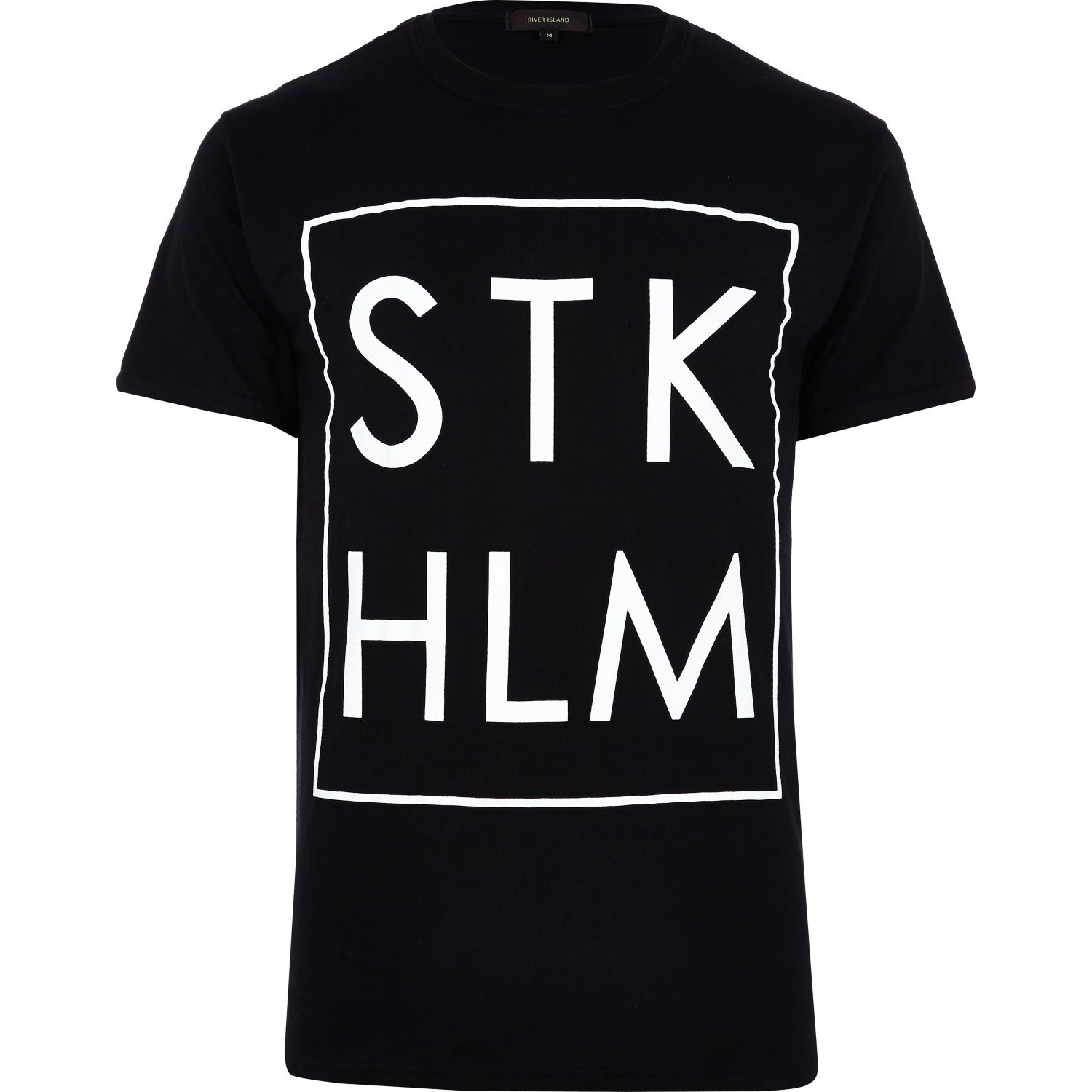
-Saving the best for last, with a whopping niche of 1.1%, come in the T-shirts I can only list under codename Brklyn. They all contain one word, usually a city name, for both sexes and throughout 3 of the 4 stores we went to, and stubbornly refuse to acknowledge vowels. The ones we found contained the words: brln, stkhlm, amstrdm, wknd, lndn, tmmrw, rndm, brklyn. Why are these a thing? the f*ck...
 |
| Seriously, why? |
 |
| Who asked for this? |
And that's it.
People could use T-shirts as wearable art, and what really eats at me is, the whole "Other" category, which was pretty damn diverse, takes up less of the market than T-shirts with the brand name on them!
This is what the T-shirt market looks like, as shown by our sample:

Yes, they look like a lot of categories at first glance. A wide range, even. But when most are lazy, bad, boring or mere ads, that's not exactly a great choice.
It's a shame, really.
____________________________________________________________________
This is our raw data:
Men's T-shirts:
Total Number of Designs Surveyed: 518
And by category:
Beach & Surf & Summer in the Sun: 74 - 14.2 %
Colourful Writing: 71 - 13.7 %
Urban & Cars & American Cities and Streets and Architecture: 67 - 12.9 %
Pretty Pattern: 55 - 10.6 %
Branded: 53 - 10.2 %
Empty Inspirational Hipster Quotes: 44 - 8.4 %
Edgy (to be read as cringe-inducing): 37 - 7.1 %
Other: 34 - 6.5 %
Sports / University Team: 13 - 2.5 %
Metal / Mafia / Look at me I'm dangerous and such a punk: 13 - 2.5 %
Music Bands: 12 - 2.3 %
Cammo: 10 - 1.9 %
Alcohol: 10 - 1.9 %
Kitsch: 8 - 1.5 %
Tiny Breast-level Drawing: 6 - 1.1 %
Skateboarding: 2 - 0.3 %
Brklyn: 7 - 1.3 %
Pocket inside Pocket: 2 - 0.3 %
Women's T-shirts:
Total Number of Designs Surveyed: 171
And by category:
Colourful Writing: 35 - 20. 4 %
Beach & Surf & Summer in the Sun: 33 - 19.2 %
Pretty Pattern: 26 - 15.2 %
Other: 17 - 10 %
Empty Inspirational Hipster Quotes: 11 - 6.4 %
Edgy (to be read as cringe-inducing): 9 - 5.2 %
Urban & Cars & American Cities and Streets and Architecture: 9 - 5.2 %
Very Colourful Animals: 8 - 4.6 %
Kitsch: 6 - 3.5 %
Sports / University Team: 4 - 2.3 %
Cammo: 3 - 1.7 %
Music Bands: 3 - 1.7 %
Justin Bieber: 3 - 1.7 %
Metal / Mafia / Look at me I'm dangerous and such a punk: 2 - 1.1 %
Branded: 1 - 0.5 %
Brklyn: 1 - 0.5 %
We simply surveyed fully those 4 large stores for both sexes. The reason there are far fewer designs surveyed from the women's section is only that there were fewer in the stores. The reason for that, as I've said, is the greater diversity in upper body garments for women, outside T-shirts.
____________________________________________________________________
Oh, and, if anyone from C&A is reading this, you should know some of your T-shirt racks look like swastikas when viewed from above. Just a heads-up.
No comments :
Post a Comment